Showing posts with label Art. Show all posts

Friday, November 9, 2012

Marion Deuchars' studio, wonderful mess

After posting about Marion Deuchars' new book yesterday, I perused a part of her website that I hadn't before—there is a little link labeled "Studio" at the bottom that led me to these photos.


What a beautiful thing to include in an illustrators's portfolio site, giving us a peek into process and mess. It makes me deeply miss having a separate studio, like one in a whole other building, something I gave up when I decided to leave the professional art world. Since I was only doing little personal pieces that weren't for sale it didn't make sense anymore. And of course without selling artwork I couldn't afford the studio anyway.But it was wonderful to have. A room of one's own where no one can judge you, in fact they might judge you if it's too clean. This isn't the era of fetish finish, the zeitgeist of the present day asks for signs of the artist's hand. Like the whole artisanal movement.If only we could all afford a studio. I would love one in the woods, like our cabin, but with a connecting door in our apartment. Maybe a little one hidden in the back of a closet where you have to get down on your hands and knees to crawl through. Oh, and you first have to look around to make sure nobody sees you go.
Photos courtesy Marion Deuchars' website, unknown photographer


Thursday, October 11, 2012

Monsters are a comin'!

A sneak peek at the artists who will be included in our upcoming quarterly titled "Monsters!"
These aren't the pieces that will be in the issue, as we're keeping those secret.

Matt Wentworth's monsters are somehow both classic and original, perfect in black and white:


And Teressa Ong's monsters are light-hearted, ready to join you on adventure or give you a little life lesson:


All images courtesy Matt Wentworth and Teressa Ong. Check out their prints here

Friday, October 5, 2012

"Building Stories" by Chris Ware


Do you know who Chris Ware is? The he's-too-uncategorizable-to-call-a comic artist? Way back when, only us comic geeks knew about him. We waited avidly for his installments of carefully crafted, unbelievably detailed "comic strips". They're not. They're wonders of graphic design that tell a story. His artwork is cold, clinical, the stories hiding within hard clear lines, and you are suckered in by the strange palette and obsessive draftsmanship and are suddenly exposed to heart-rending tales. He's a trickster. And apparently a nice guy.

I remember when I was in college that my father said "The one person you are never allowed to marry is Chris Ware". 

In many of his collections there are cut-outs that you can construct into elaborate creations, and in this one you can build an entire paper house. Look at that toilet. This guy is nuts. But apparently a nice guy.

These days many people are familiar with his work, as he has graced the covers of The New YorkerNew York Times Magazine, and covers of Penguin Publishing's classic novels. I feel a little like a cult fan who's grumpy over their band getting big. But in the comic world you can never begrudge these hard-working, little-earning artists their fame.

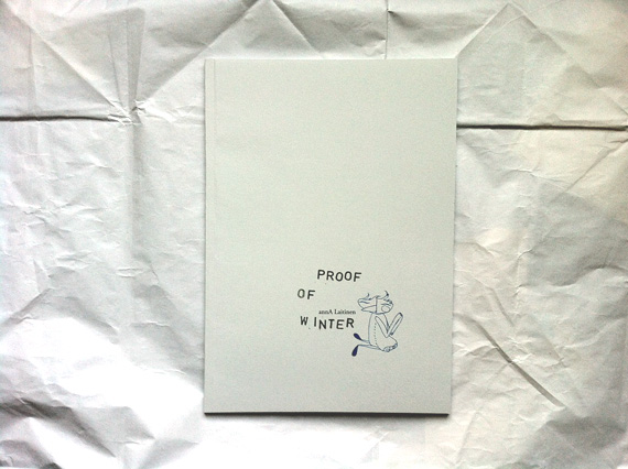
And now his new collection, "Building Stories" published by Drawn & Quarterly, which I only just heard about and have yet to purchase. There is only one of his compilations that I never got, one that I knew was just too sad for me to own. But he is one of the few artists/writers of whom I've got nearly everything. It might be time to be sad.

All artwork by Chris Ware, top three images courtesy Barnes and Noble, bottom three courtesy of the Drawn & Quarterly Blog.


p.s. If you feel like it, here is the full review from Publishers Weekly which really encapsulates it better than I can:

"Ware provides one of the year’s best arguments for the survival of print. In more than 200 pages spread over 14 separate printed works that include broadsheets, booklets, and full-sized books, Ware tells the visually stunning story of a nameless woman as she lives a quiet, frustrated life in Chicago. Ware gives voice not only to his nameless heroine but to the people who pass through and fill her life, peering in on the dysfunctional couple that lives below her, the wistful memories of the woman’s ancient landlady, the old and crumbling building she lives in, and even the comedic blunderings of a bee named Branford, bringing together stories filled with grief, doubt, and self-loathing. Ware’s paper archipelago can be read in any order, making his heroine’s progression from single apartment life to dissatisfied motherhood in Oak Park, all the more personal, as if the reader is leafing through her memories, rather than following her linear story. Ware’s artwork consistently overshadows his creation’s anxieties, her frets and worries made even smaller and pettier by Ware’s intricate and expansive art. But the spectacular, breathtaking visual splendor make this one of the year’s standout graphic novels."

Monday, September 24, 2012

Bella Foster


If you don't know the expressive artwork of Bella Foster, allow me to introduce her: Bella Foster, meet Kind Readers, Kind Readers, meet Bella Foster. Her work gives an impression both of intuitive ease and mastery, mastery of color, line, composition, material. And not just of paint and brush but of paper as well—when to let the paper shine through as its own bright power. She doesn't hit one wrong note. There are no moments of hesitation in her work, even if there might be some behind the scenes. It looks like she paints in an outpouring of inspiration while dancing to her favorite music. I am probably totally wrong. But the work not only evokes joy, it imposes joy on you.

I've been obsessed with watercolor and brushiness lately, to the point that I am concerned about its faddishness. Particularly since I frequently work in watercolor myself. But then I look at work like this, like Bella Foster's, and know that fads don't matter. She makes me want to paint more and that is the most amazing thing of all.


All images by Bella Foster, courtesy of her blog Here There and Them. Certain prints available through Wayne Pate and Stampa

Friday, September 21, 2012

One more from Julienne Mei Tan

Another great illustration by Julienne Mei Tan. What a way to capture summer. What a pool. This should exist.

Image by Julienne Mei Tan

Julienne Mei Tan


Through some path I came across the work of Julienne Mei Tan, a student at the School of Visual Arts here in NYC. It's amazing what accomplished mature work can be done by someone still in progress, and the internet is like a forest with a million tiny paths that you can follow to little miracles. Treasures like tiny fieldmice, still in progress, still small, but on the way to getting big. To be a giant fieldmouse.

The last one is a particular favorite of mine. It looks like a portrait of someone pathetic, but there is a secret behind it—this is an unusual grand mother:

"This is my halmoni (grandma). She just sits around all day like this. Doesn't even care if guests are over, it's underwear all day. And she just sleeps like this all day. You can't even wake her up. I love my halmoni. She taught me all the swear words I know."

Check out more of Julienne's work her blog and marvel at a work in progress.

All images by Julienne Mei Tan

Monday, September 10, 2012

Discovering Theodor Kittelsen

I wrote a post a while back an illustration that I couldn't find the artist for, which always makes me ask the internet and the universe Who Is This Marvelous Person. And the internet and universe answered me, thanks to Sarah Cannon who wrote "By Theodore Kittelsen. Google's image search is wonderful for forgotten black holes of discovery."

Apparently Kittelsen is also a little bit of a forgotten black hole, someone who died a broken man but whose artwork was still valued. A little. Enough to appear in Google image search and still have a book on Amazon, "Norwegian Troll Tales".


A lot of my obsession with these illustrations relates to my own artwork, which used to primarily be in graphite, pencil or powder. I don't do any large-scale artwork anymore, and have completely divorced myself from the commercial Art World. Despite selling quite a number of pieces and having interest from a gallery etc, to many others' complete bafflement I told everyone "Sorry, I'm not going to show anymore. I'm not going to sell anymore". It was simply not for me.

Anyway. I long steered clear of using charcoal (which I think is what Kittelsen used) because I felt the lush darks were too easy to love, too easy to fall into rather than the subject matter itself. Now I wonder why I was opposed to people falling in love with the material. Look at those darks sinking into the cottony paper. And yet his subject matter, that magic is everywhere, even in a dying tree or crashing wave, shines through his technique and materials.

I am mostly doing this post for myself, so that when I begin making art again, even if not for sale, I don't forget letting anyone fall in love with the materials and want to touch the plush velvetyness.

All images by Theodor Kittelsen, courtesy of the official website

Wednesday, August 29, 2012

"Proof of Winter" by Anna Laitinen


I recently discovered the artwork of Anna Laitenen (or as she often signs herself annA Emilia), an artist illustrator working in Finland, a country I obsess about and plan on visiting one day. See my Moomin posts. It's a land filled with lakes and seashores and cold and tiny flowers and tiny islands. Though this artist book of hers is about a winter spent in Iceland.

Anna's work is delicate and filled with nature, or nature intersecting with huts and beds and tea. Tiny blossoms and ice crystals abound. This book, "Proof of Winter" (available in her shop and promptly shipped out from Finland),  is about finding a way to love winter in all its brutality and desire to not be friends with anyone. So she creates a wonderland in her own home, "Inside the house I played the biggest icicle instrument".

But here I'm just showing her packaging. Her immaculate lovely packaging. The notecard! The matching patterned tape! The ocean-colored string! Her perfect perfect loopy handwriting! The book is a pleasure, even more surprisingly because the text is so in resonance with my own magical thinking. Oh Anna, may I come visit Finland and discover the same things that inspire you so much. Although I don't think I have the courage or stamina to spend a winter in Iceland, despite my love of Bjork and her love of the crisp sound of crunching through snow in winter there.

Photos by me, amazing book and thoughtful wrapping by Anna Laitenen

Monday, August 27, 2012

More Miga de Pan


Because I can't get enough of her. It seems that the only place you can purchase her goods is on the website of a shop called Confetti which I believe is in Rotterdam. But for those willing to brave the Euro exchange rate I believe these are worth it.

All objects by Miga de Pan, images courtesy Confetti 

Friday, August 24, 2012

Miga De Pan


 This is what she calls an "illustration" for the store opening exhibition of Paula Ledesma, although I don't know what or where that is. You must discover Miga de Pan, a Buenos Aires artisan, who calls her blog "Modern handmade for babies, kids & home". But this is art pure art.

All images by and courtesy of Miga de Pan

Thursday, August 23, 2012

How a party should be


Also from the second volume of "Moomin: The Complete Tove Jansson Comic Strip", published by Drawn & Quarterly